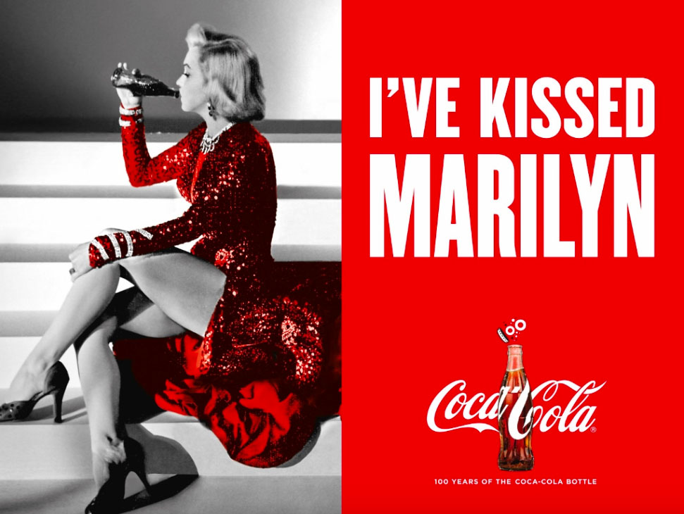
The goal of this post is to show you common design techniques advertisers use to draw us in and inspire interest in us, specifically the use of contrast, repetition, alignment, proximity, and color. We are going to use an ad from Coca-Cola from 2015. The ad was to celebrate the 100 year anniversary of their iconic bottle. The ad features not just Marilyn Monroe (featured in this post), but Elvis Presley and Ray Charles as well.
Contrast
Coca-Cola did a great job of using Contrast while still keeping it simple. They only used their iconic colors of red, white and black as well as a bottle of coke. They used red as their background and white for their colors just as they do on their coke bottles. They also used their usual script font for “Coca Cola” but they paired it with a bold sans-serif font. They used the cap of the bottle to make a 1 for the 100 which is in a decorative font – setting it apart from the rest of the text. They also made Marilyn Monroes picture black and white, other than her dress. It increases the contrast between each half of the page while also emphasizing the red of Coca-Cola.
Repetition
They did a great job with repetition in this ad. They had a constant repeat of their colors red, white and black. Matching Marilyns dress to the red of the second half of the add. They also have the repetition of the white background into the white wording. They also made all of their wording right which helps us see that it is all related. They have the repetition of the Coke bottle on each half of the page. The font of the phrase “I’ve kissed Marilyn” is repeated at the bottom with “100 years of the Coca-Cola bottle”. They reacted 100 twice as well which is essential as the ad is about the 100 year anniversary of their bottle.
Alignment

Alignment is essential as it helps draw our eyes to what is most important. Coca-Cola used alignment to great effect by using leading lines to the photo to point at the coke bottle in Marilyn Monroe’s hand. This then points us to the text “I’ve Kissed”. Additionally, “I’ve kissed Marilyn” is all aligned and leads down to the rest of the text. “Coca Cola” and “100 years of the Coca-Cola bottle” is also aligned.
Proximity
Proximity is used very well here as is space, giving our eyes room to rest. Marilyn Monroe’s head and torso is closest to the phrase “I’ve kissed Marilyn”. The focus of the ad – the coke bottle – is right next to Marilyn Monroe’s face and in the middle of the Coca-Cola symbol. Both mentions of 100 are in the same area. There is also mention of the coca-cola bottle right next to a picture of the bottle. They also used space to separate the two main focus’ of the ad.
Color

Color use is phenomenal in this ad as well. Keeping the Coca-Cola brand’s colors for their ad reiterates who the ad is for. Red and white contrast really well and it helps make their information pop off the page. Red is a high energy color while the white is more calm. Contrasting colors also creates good space for our eyes to rest. Turing the picture of Marilyn Monroe black and white (except the dress of corse) also helps to reiterate the brand’s colors. The inverse of the colors on each half of the page also helps to create both contrast and unity, so we know which things are important and related.
Though the ad is simple it clearly states its purpose while also drawing our eye. It uses each of the elements of design with purpose and does it well. Coca-Cola made us excited about their brand, especially their iconic bottle. It also took us back to a time past with their use of beloved celebrities from the last century. Their use of such celebrities also influences us with thoughts of joy, thereby associating their brand with the same happiness.
